The T Room is a distinct upstairs bar attached to The Jones Assembly in Oklahoma City. Named for the speakeasies from the 1920’s where booze was served in teacups to avoid suspicion from the authorities, as well as the original purpose of the building, which was to make Ford Model T’s. The mark, as such, recalls the geometric art-nouveau movement while also pulling inspiration from hood ornaments.
Page layout and typography samples.
Further page layout examples.
Illustration samples of 18 custom illustrations over three menu iterations
The T Room menu volume II cover. Created in a Mohawk Forest Green Vellum duplexed with white paper.
Interior view of the menu with napkin.
Details of the menu foiling and napkin embroidery.
View of menu set.
Rise Coworking opened in 2017 in Moore, Oklahoma. Envisioned as a space for individuals to work in a collaborative environment, the location reaches the underserved community of Norman as well as those in south Oklahoma City. The brand identity was created with a clean aesthetic with modern elements. The underlying element within the Rise identity is a yellow triangle, directly symbolizing upward movement while also indirectly symbolizing the positive outcomes that arise from a collaborative environment.
Primary mark.
Supporting marks to add depth and flexibility to the brand.
Exterior signage creation and coordination.
Environmental photo to establish the overall vision of the Rise space, photo author unknown.
Brand vision consulting for supporting elements. Stationery designed by Avery Wilson, photo taken by Natalie Kent.
Brand vision and mark in application. Business card designed by Avery Wilson, photo taken by Natalie Kent.
Brand elements and consulting in application. Mug designed by Avery Wilson.
David Bowden is a Christian author and spoken word poet in Oklahoma City. The DB monogram represents the holy trinity by use of the three triangles as well as the kingdom of God with the dual symbolism of a crown. Furthermore, the badge and multiple layouts add a sense of heritage and humbleness to the overall brand feel.
Badge brand mark.
Primary brand mark.
Supporting icons for brand depth and flexibility.
Enamel pin and backing card design.
Postcard handouts and business card designs.
Stage banner designs. Created to be flexible enough to fit every performance space with the use of individual banners, any combination of 2 banners, or all 3 together as shown.
Merchandise tags.
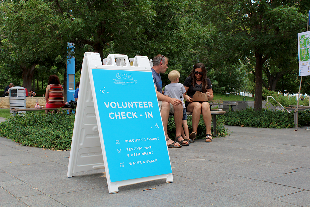
The Peace Love and Goodwill Festival is an annual festival in the heart of Oklahoma City that ran from 2012 to 2017, created to raise funding and awareness of the services that Goodwill provides to the Oklahoma community. 2017 was a special year for the brand visuals. The previous festival logo was updated and built upon to create a more capturing and whimsical experience. Specifically, this update involved a simplification of the original mark, creation of a custom icon family, updated typography, and intricate patterns. The entire festival, as well as the sub-brand, Once Upon a Princess, were completely updated to create a cohesive festival experience with signage, merchandise, advertisements, and web graphics.
New brand visuals as well as updated festival logo.
VIP t-shirt design.
Festival shirt design.
Enamel pin and backing card design.
Sticker designs, created for the step-and-repeat activities at the festival.
Festival staff and VIP lanyards.
Festival poster.
Festival signage in application. Photo by Natalie Kent.
Festival experience photo provided by Goodwill.
Signage in application. Photo by Natalie Kent.
Signage in application. Photo provided by Natalie Kent.
Signage in application. Photo provided by Natalie Kent.
Photo booth background design and badges in application. Photo provided by Goodwill.
Festival experience photo provided by Goodwill.
Bravura Collective is a membership-based beer enthusiast club and sub-brand of Bravery Brewing in southern California. The series of labels for them features hand-drawn imagery to illustrate the special edition brews and their unique inspiration stories.
Bravura Collective mark. Designed by Amanda Treadwell.
Three Blind Mice gift set. The three illustrations ominously tell the tale of the Protestant bishops who were accused of plotting against Queen Mary I, the origin of the “Three Blind Mice” nursery rhyme.
Agave Oscuro label. The agave plant is paired with a pattern of ancient Mayan symbols to visually tell the Mayan myth behind the agave plant – the inspiration behind this tequila barrel-aged dark ale.
El Gigante label. This label tells the story of a giant greatly feared by the villagers, who one day brings them a delicious bourbon barrel-aged barleywine infused with cacao and coffee beans. The story is illustrated by the scene of the giant delivering the ale to the villagers paired with a background of cacao leaves.
Rancor label. This label tells of a disastrous shipwreck amongst the jagged rocks and the loyalty of its captain. This triple IPA is directly illustrated by the main scene while the thorny brambles in the background allude to the intense flavor within the brew.
Oeuvre label. This label speaks to the artistry and meticulous nature of the Bravura Collective as a whole. The imagery of scholarly books and music notes speaks to the greatly inspired brew within, which is a complex and extremely unique dark ale blend.
Three Blind Mice in application. Photo provided by Bravery Brewing.
Agave Oscuro in application. Photo provided by Bravery Brewing.
Oeuvre in application. Photo provided by Bravery Brewing.
Centerpoint Construction is an Edmond-based commercial and residential construction agency. Their values are rooted in quality that begins from the inside out. The CP monogram, therefore, represents a floor plan, executed with meticulous detail and precision.
Primary logo.
Letterhead, business card, and #10 envelope design.
Folder, invoice, notecard, and notecard envelope design.
Sample pages from the Centerpoint Brand Standards.
Website design.
Business card in application to illustrate the black foiling and white ink execution of the cards themselves. Photo by Natalie Kent.
Stationery in application.
Cleats 4 Kids is a non-profit organization that believes extracurricular activities are the key to building strong character and better futures for students. This group of passionate individuals provides both gently used gear and funding to Oklahoma City schools to equip students in need. Their website and updated brand materials were products of their request to refine their vision and make public involvement an easier and more intuitive process.
Full site designed with new brand elements including colors, icons, photography styles and typography.
Multi-platform responsiveness.
Brand collateral created for the team members of C4K Oklahoma.
Iconography implemented as new brand elements introduced in the website
Nextep is a expert in HR needs with the capability to help small businesses with employee management tasks including payroll, benefits, hiring and termination, and training to name a few. The following is a leave-behind packet that was custom-built to solve the needs of their salespeople. Their needs included a more cost-effective packet to leave with potential clients that could hold multiple booklets, customized loose-leaf pages, and a business card. As a result, this piece checked all of those boxes and more by creating a completely custom trifold template. This trifold folder also houses a customized 30 page interior booklet with an engaging infographic-style page layout that captures the light-hearted character of their updated brand.
Folder and booklet. The right vertical pocket serves as a place for miscellaneous loose-leaf pages and slits for a business card. Photo by Callie Ridley.
Photo by Callie Ridley.
Photo by Callie Ridley.
Photo by Callie Ridley.
Light touch details like a blind embossed cover were created to make this trifold packet stand out as something truly special. Photo by Callie Ridley.
Booklet cover. Photo by Callie Ridley.
Sample of interior pages. Photo by Callie Ridley.
Sample of interior pages. Photo by Callie Ridley.
Sample of interior pages. Photo by Callie Ridley.
Overview and sample of selected pages within the booklet.
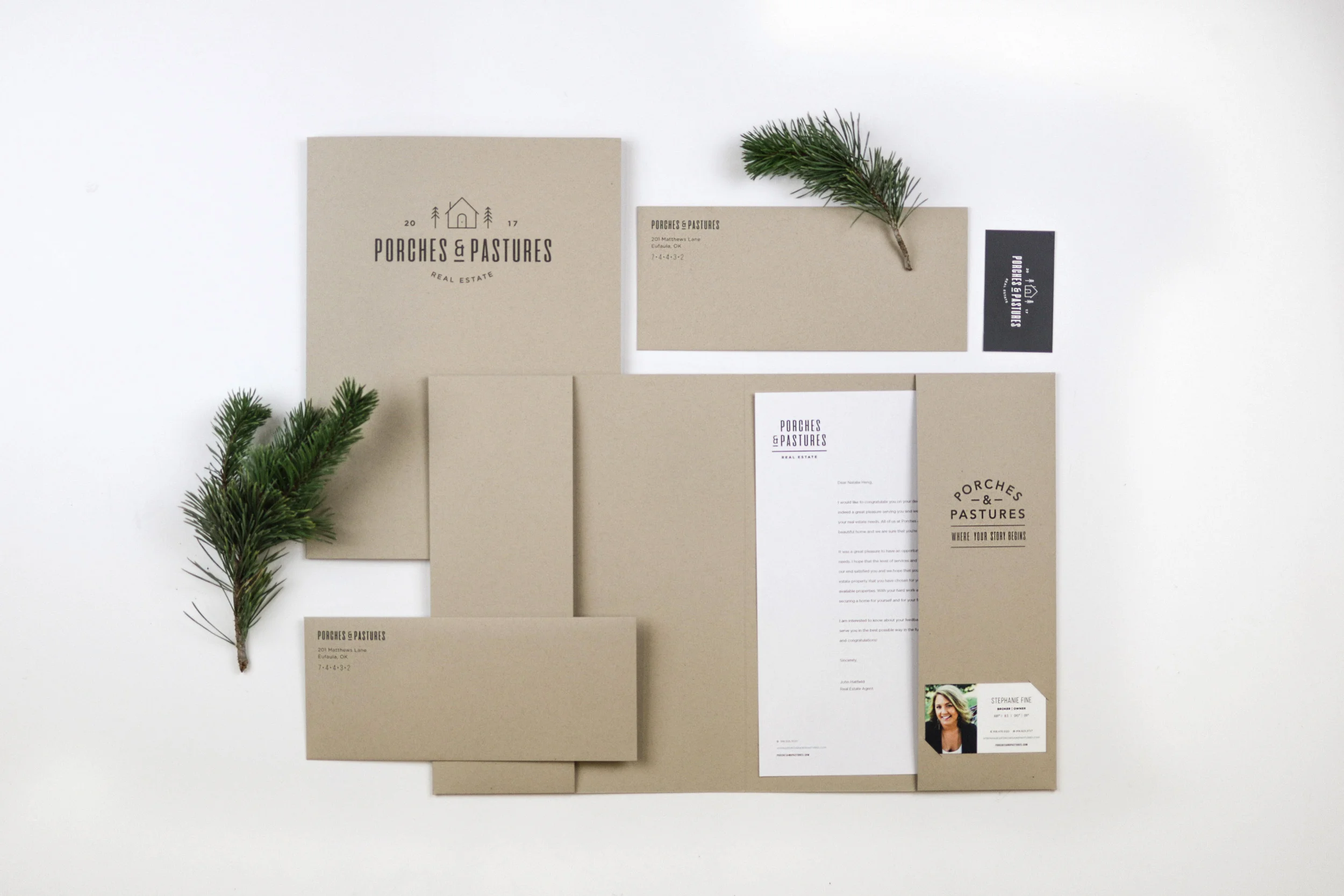
Porches & Pastures Real Estate is a brokerage that focuses specifically on lake homes, lakeside property, and developments in and around Lake Eufaula, Oklahoma. The brand created for them encompasses the natural, casual, no-frills attitude of lake life and the friendliness of their company by use of an eclectic logo set, natural kraft textures, and an organic color palette.
Primary mark.
Full logo set.
Brand feel photography. Photo provided by Porches & Pastures.
Stationery overview. Photo by Callie Ridley.
Business card design. Photo by Callie Ridley.
Custom folder template and curated printing specifics for the entire brand. Photo by Callie Ridley.
Folder made from Neenah Kraft-tone paper. Photo by Callie Ridley.
Envelopes made with Neenah Kraft-tone paper. Photo by Callie Ridley.
Photo by Callie Ridley.
Photo by Callie Ridley.
Supporting mark in application on envelope flap. Photo by Callie Ridley.
Signage sample of a full set of real-estate signage (not shown).
Brand feel photography. Photo provided by Porches & Pastures.
These designs are from two different distributors but both speak to the power and fun that a one-off design can have and both illustrate the beauty of two completely separate styles.
Special Release detail shot. This design incorporated the logo placement of previous can designs to create a sense of cohesion when seen on the shelf next to each other, while taking a completely new route with the use of icons, color, and intricate linework that sets this can apart from the rest.
Bravery Brewing Special Release Spring 2018. Photo provided by Bravery Brewing and edited by yours truly.
Magic Juice in application. Photo provided by Elk Valley Brewing Co.