SOCIAL MEDIA TEMPLATE & ANIMATED DIGITAL CAMPAIGN
Kitchen No. 324 is a farm-to-table restaurant catering to the downtown Oklahoma City audience. Located in the historic Braniff building, their allure lies with their wall-to-wall windows, marble tabletops, and casual-yet-sophisticated dining experience.
With their identity as fresh as their menu, the challenge was to show off both the lifestyle and the food they are offering. The solution was a solid color social media template, showcasing their crisp green that enhances the beauty of their menu items on their social feed. For specialty posts to encourage engagement and excitement with their followers is a series with thoughtful animation and quirky copy. Nothing pairs better with an afternoon cocktail than quick wit.
CLIENT
A Good Egg Dining Group
AGENCY
Braid Creative
IDENTITY / DIGITAL & PHYSICAL PROMOTIONAL MATERIALS
As a designer with a love of yoga, Shannon Stephens was the dream client to work with. Her passion for physical and mental wellness breathes into every aspect of her life. Following the decision to move her business to the Paseo district of Oklahoma City, she was in need of a refreshed identity that both spoke to her wellness ideals and her true appreciation for the community that she calls home.
The mark created for This Land Yoga is comprised of a circle, sacred and continuous, combined with the iconic waving wheat representing the prosperous and peaceful land that she calls home.
CLIENT
Shannon Stephens
AGENCY
Braid Creative
IDENTITY / WEBSITE & PROMOTIONAL MATERIALS
Karlos K. Hill is an author, a speaker, and a scholar with a desire to sow the seeds of change with knowledge of the past. His books and media appearances bring historical context and perspective on current events, from the outcry against police brutality to disruption of systemic racism. Hill’s identity was thoughtfully created to empower this motivation. Hill’s passion for change is embodied by a striking display mark, historical photos, and a bold color overlay that captures his readers’ attention, giving him a platform to inform his audience and create a better future for Black Americans.
CLIENT
Karlos K. Hill
AGENCY
Braid Creative
IDENTITY / MENU DESIGN / DIGITAL & PHYSICAL PROMOTIONAL MATERIALS
The T Room is a distinct upstairs bar attached to The Jones Assembly in Oklahoma City. Named for the speakeasies from the 1920’s where booze was served in teacups to avoid suspicion from the authorities, as well as the original purpose of the building, which was to make Ford Model T’s. The mark created, as such, recalls the geometric art-nouveau movement while also pulling inspiration from hood ornaments.
CLIENT
The Jones Assembly
AGENCY
COLLABORATORS
Madi Rae Jones - Photography
CAMPAIGN & EVENT BRANDING
Tinker Federal Credit Union is nothing if not loyal to its members. Their outreach to the community is unparalleled, with monthly give-backs, quarterly auto-loan payoffs, and multiple scholarship awards naming only a few of their community engagement programs. One specific example is their partnership, which offers local businesses payroll deductions, financial wellness programs, and event representation. Every year, TFCU puts on a Business Partner Luncheon to thank their local businesses with a dinner, auction, raffle, and a carefully selected speaker to encourage and motivate their members. In 2019, their speaker was a civilian interrogator with the Defense Intelligence Agency with over 2,700 interrogations under his belt, speaking to the art of listening.
Each year, TFCU shines a light on its Business Partner Luncheon by creating a completely unique event identity to cater to its speaker and the year’s motivational message. This event identity was created to seamlessly fit with the established TFCU brand while taking a creative departure to focus on their speaker Eric Maddox’s patriotism and the physical representation of the power of listening.
CLIENT
Tinker Federal Credit Union
AGENCY
Braid Creative
IDENTITY & DIGITAL PROMOTION MATERIAL
Jeremy Foraker, the founder of The Foraker Company, has his finger on the pulse of Oklahoma City. With his eye for commercial real-estate, Jeremy and his company are starting a new venture in Oklahoma City’s Automobile Alley. In his words: “The railroad tracks that run through downtown Oklahoma City are part of our history. We named our building, The Rails, as a nod to the location on 9th, as well as the blend of old and new, industrial and livable... for people who want to be close. to everything but also feel at home.”
The Rails identity was created as such to reflect the juxtaposition of historic walls with a modern heart.
CLIENT
The Foraker Company
AGENCY
Braid Creative
EVENT BRANDING / PHYSICAL & DIGITAL PROMOTIONAL MATERIAL
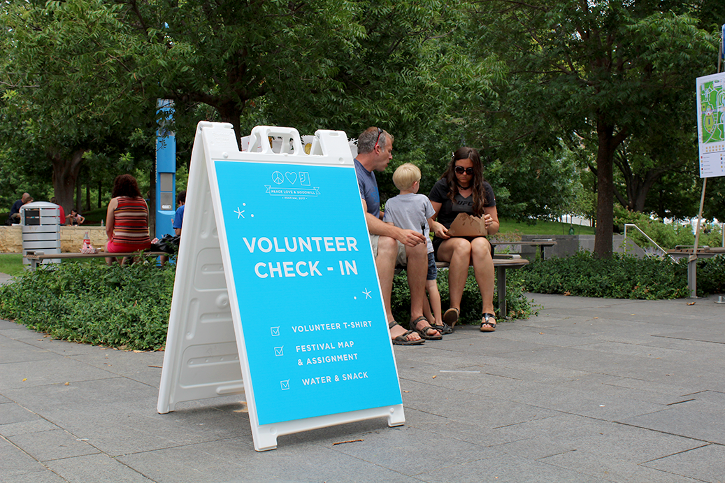
The Peace Love and Goodwill Festival is an annual festival in the heart of Oklahoma City that ran from 2012 to 2017, created to raise funding and awareness of the services that Goodwill provides to the Oklahoma community. 2017 was a special year for the brand visuals. The previous festival logo was updated and built upon to create a more capturing and whimsical experience. Specifically, this update involved a simplification of the original mark, creation of a custom icon family, updated typography, and intricate patterns. The entire festival was completely updated to create a cohesive festival experience with signage, merchandise, advertisements, and web graphics.
CLIENT
Goodwill of Oklahoma
AGENCY
Nominee
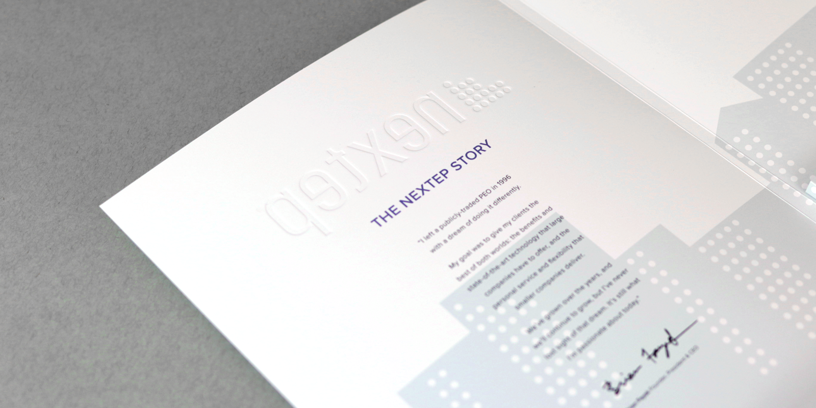
INFOGRAPHIC DESIGN / PAGE LAYOUT / CUSTOM PACKAGE DESIGN
Nextep is an expert in HR needs with the capability to help small businesses with employee management tasks including payroll, benefits, hiring and termination, and training to name a few. The following is a leave-behind packet that was custom-built to solve the needs of their salespeople. Their needs included a more cost-effective packet to leave with potential clients that could hold multiple booklets, customized loose-leaf pages, and a business card. As a result, this piece checked all of those boxes and more by creating a completely custom trifold template. This trifold folder also houses a customized 30-page interior booklet with an engaging infographic-style page layout that captures the light-hearted character of their updated brand.
CLIENT
Nextep
AGENCY
Nominee
IDENTITY / PROMOTIONAL MATERIALS
Rise Coworking opened in 2017 in Moore, Oklahoma. Envisioned as a space for individuals to work in a collaborative environment, the location reaches the underserved community of Norman as well as those in south Oklahoma City. The brand identity was created with a clean aesthetic with modern elements. The underlying element within the Rise identity is a yellow triangle, directly symbolizing upward movement while also indirectly symbolizing the positive outcomes that arise from a collaborative environment.
CLIENT
Jordan Clark
AGENCY
Nominee